
SECURITY CHECKLIST / UX design
Encourage users to upgrade account security actively with gamification
PROJECT DESTAILS
16-week project, PD-driven, various stakeholders
ROLE
Product designer
Project manager
Data analyst
TOOLS
Figma
Amplitude

Problem
Security measures play an essential role in anti-scam. However, even though several serious scams have been reported recently, the enabling rate of security measures keeps stagnating.
📈 Objective
Improve the anti-scam capability by improving the overall enabling rate of security measures.

Pain point
Why users don't take action to protect their accounts and assets? After role-play analysis, we found the pain points when setting up security measures.
📌 Tasks lack priority
Users might know they need to protect their accounts, but when facing the various options in the security center, it is easy to lose track of what things they need to do, and what things they have and haven't done.

📌 Information gap
The copy is not easy to follow up and transparent enough. It only tells what the security measures are, not how they help accounts anti-scam. Moreover, the naming of some security measures is too abstract to understand, making the conversion even worse.

Solution
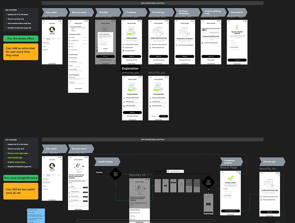
💡Security checklist: a gamified reminding system
It's a centralized quick entry, helping users check all unfinished security settings at once. With the introduction reel and rewarding feedback, the setup process is as seamless as playing a game.

1. Entry
When users enter the security center with unfinished security items, users will see the checklist banner on the top of the page, reminding them to keep leveling up their account security.
The progress bar and theme color update when the security status changes.
The banner will disappear to reward users who complete all settings.
2. Introduction reel
Once the users click 'Set up' on the entry banner, they will visit the introduction reel. Here, users get to know why and how to enable each security measure in a fun and easy way.
Once users are encouraged, they can jump to the enable flow by clicking the 'Enable now' button.
3. Feedback reward
Once users successfully enable one measure in the checklist, they will see the reward feedback page, which also provides a shortcut for them to continuously enable more.


Progress
- Competitor research
- Ideation
- UXR
- Decision making
- Finalizing
- Release process
- Data analysis

Competitor research
Ideation: two design direction

Data analysis: user path analysis
Competitor research
- Competitor research
Based on three directions: structure, expectation management, and entry design, I case-studied nine competitors, in and beyond the crypto industry.
- Ideation
Evaluated with PM, two proposals stand out in the final round:
1. Educational reel
2. Centralized reminder page
- Userablity testing (UT)
Collaborated with UXR, we did a round of user tests to decide the final direction. To our surprise, the effect & experience feedback of the two proposals are similar. Taking the business requirement as the primary principle, the educational reel was chosen, as it was more encouraging and pushy.
- Finalizing
Based on user research suggestions, I worked closely with copy designer, visual designer for a more easy-to-follow introduction. On the other hand, conducted data analysis plan with data support team.
- Release process
For user experience consistency and data analysis requirement, the release is under grey scale, from 5% to 100% in around 4 weeks.
- Data analysis
The data analysis includes 2 parts:
1. AB test to compare the encouragement effect of each security measure's binding rate.
2. Amplitude event tracker to trace user path and action on each page
Benefit the overall setup rate by 7%, show significant effect (increase by 58% and 21%) on measures that are less familiar to users(anti-phishing code and authentication method).
Takeaway
📝 Design
This is my most explorative UX design project and my first project to work with UXR. We spent a long time on direction comparison. During the process, I realized that ownership even played a more important role than judgment.
📝 Process
It was my first time driving a project as PM. I made quite an effort to find the balance between the role of PD and PM.
Though the project is not a giant one, it involves almost all stakeholders that I can imagine. I gained precious experience in time management, information synergy, all kinds of communication, persuasion, and the art of escalation.